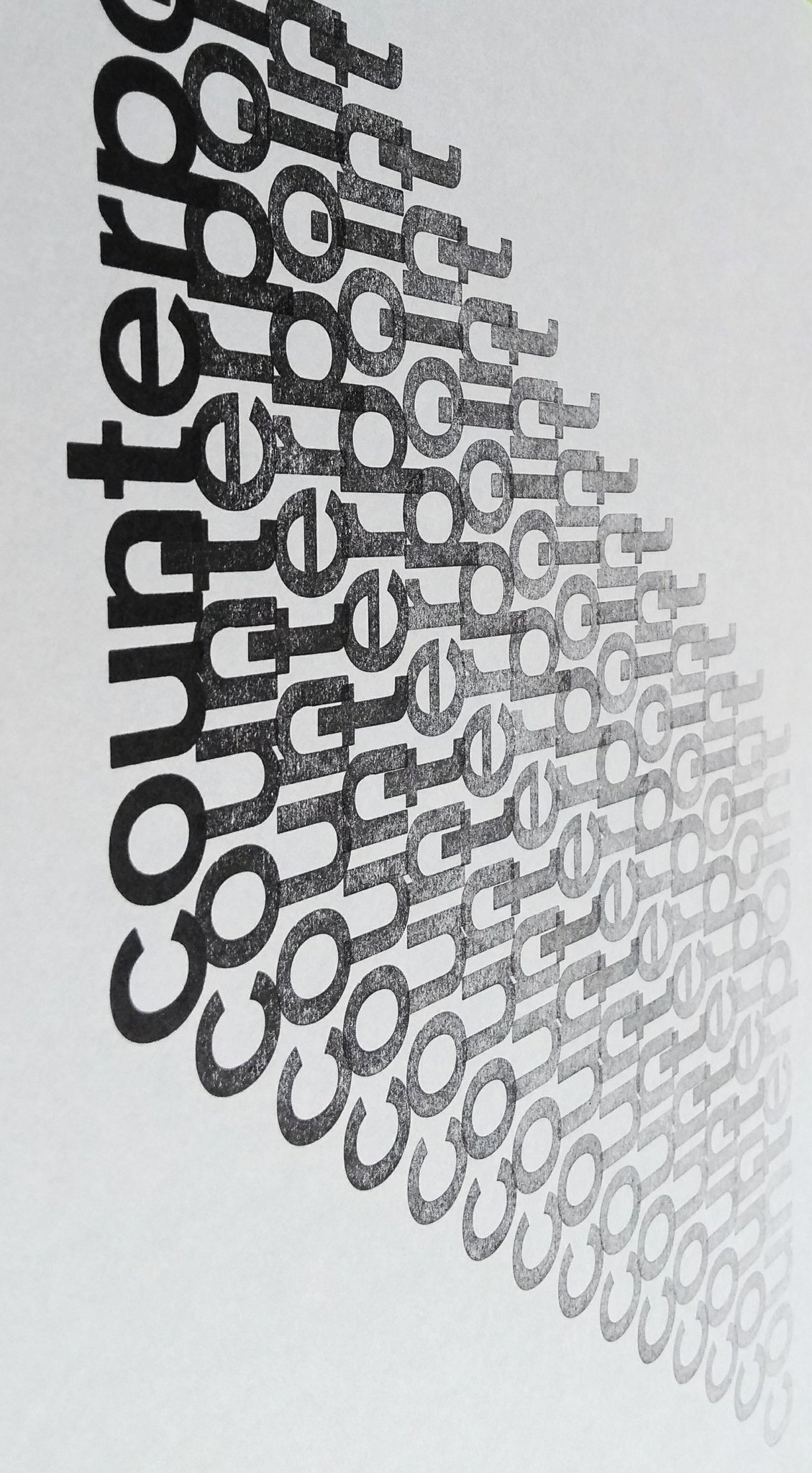
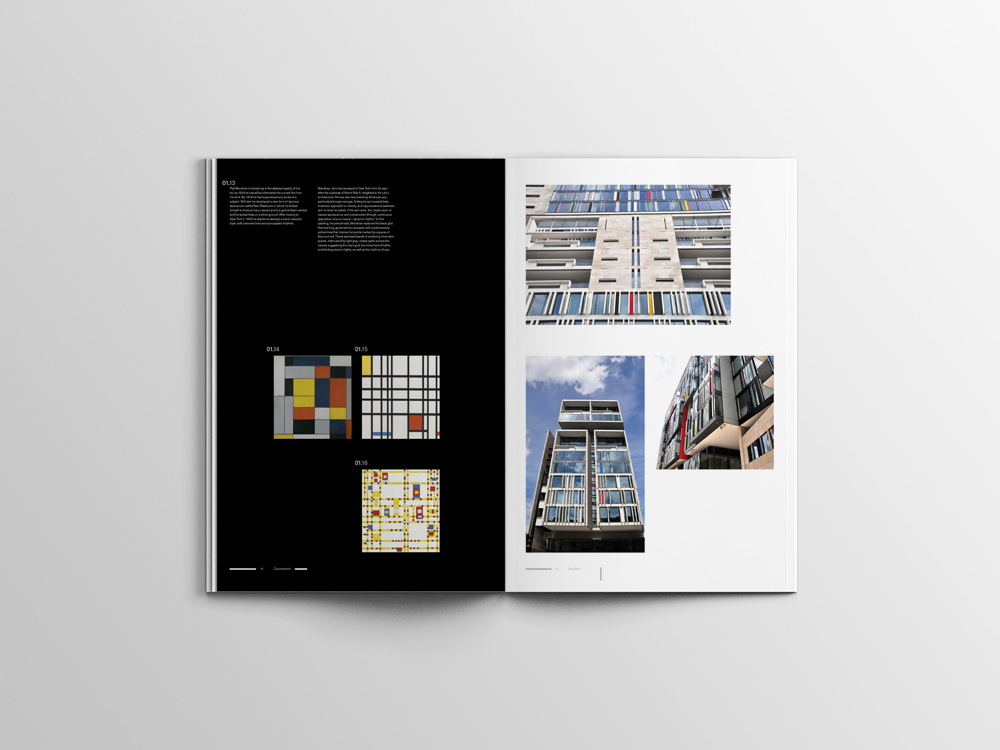
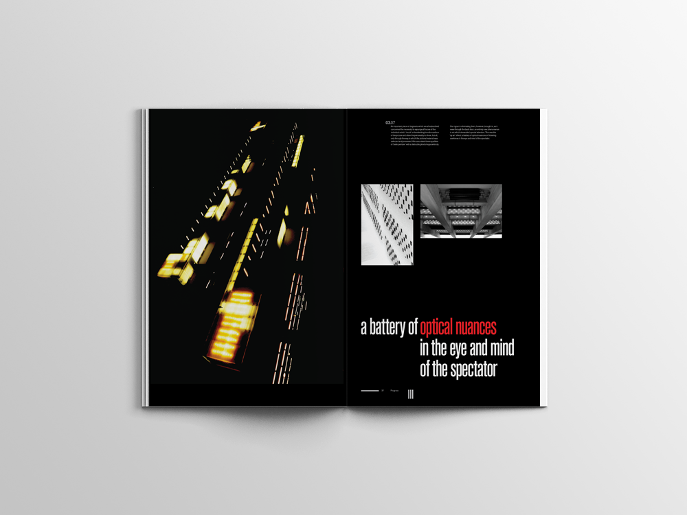
Counterpoint is an A3 publication I designed as part of an editorial design brief, exploring 'structure in the city'.
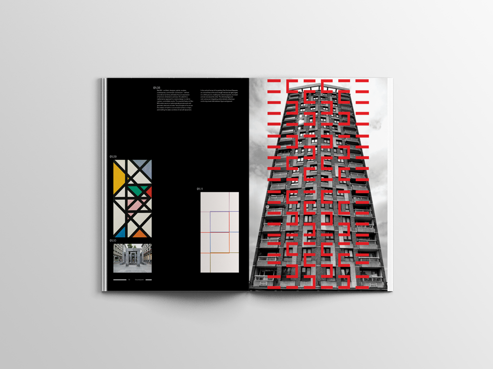
I focused on the rhythmic elements and repeating patterns of architecture in London and used musicality as a narrative guidance, whilst also highlighting examples of constructivism, suprematism, concrete and Op-art to re-enforce my theme.
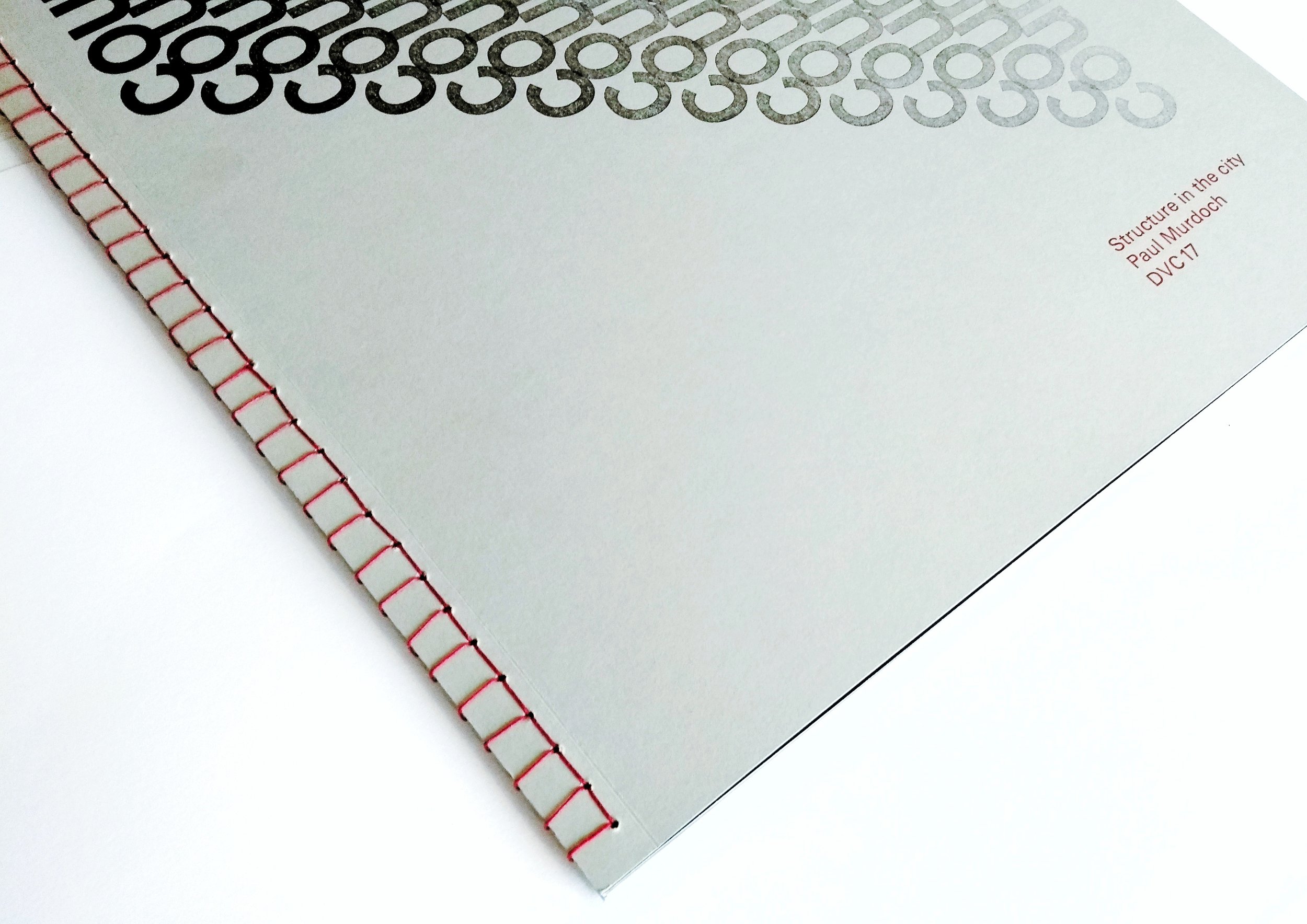
I used letterpress to print the cover of my publication and hand-bound the pages using Japanese binding technique.
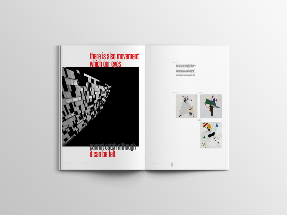
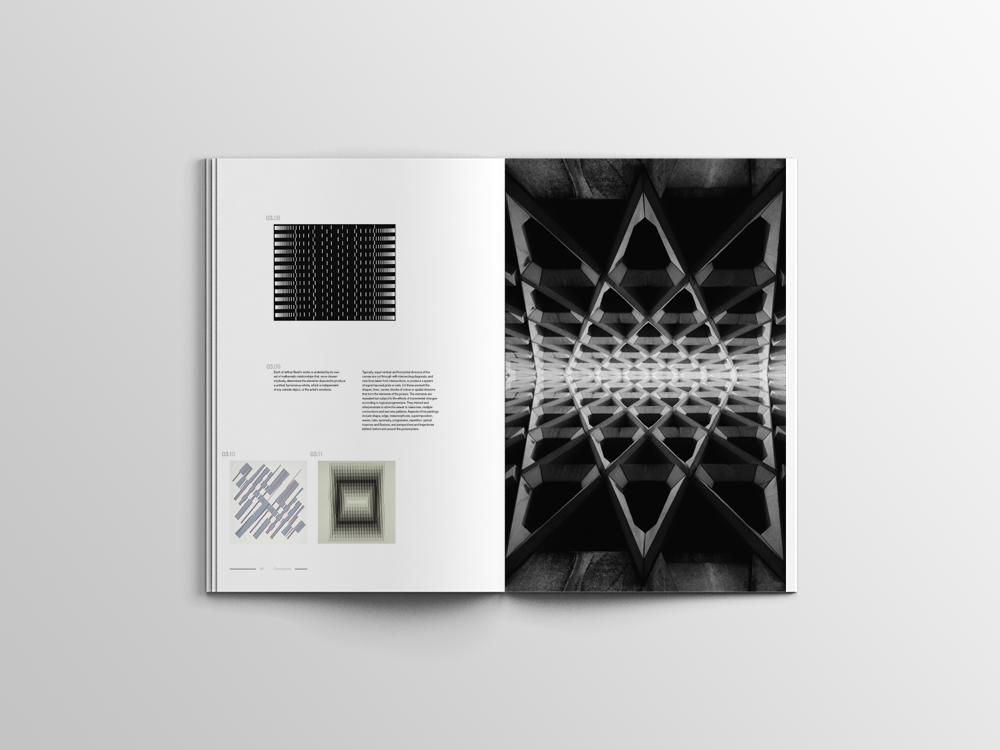
Counterpoint is an A3 publication I designed as part of an editorial design brief, exploring 'structure in the city'.
I focused on the rhythmic elements and repeating patterns of architecture in London and used musicality as a narrative guidance, whilst also highlighting examples of constructivism, suprematism, concrete and Op-art to re-enforce my theme.
I used letterpress to print the cover of my publication and hand-bound the pages using Japanese binding technique.
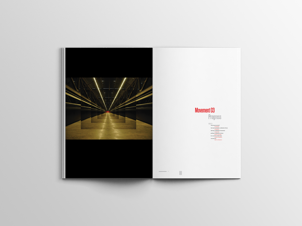